New York Times Word Usage Frequency Chart – An Update
A timely update of an informative chart
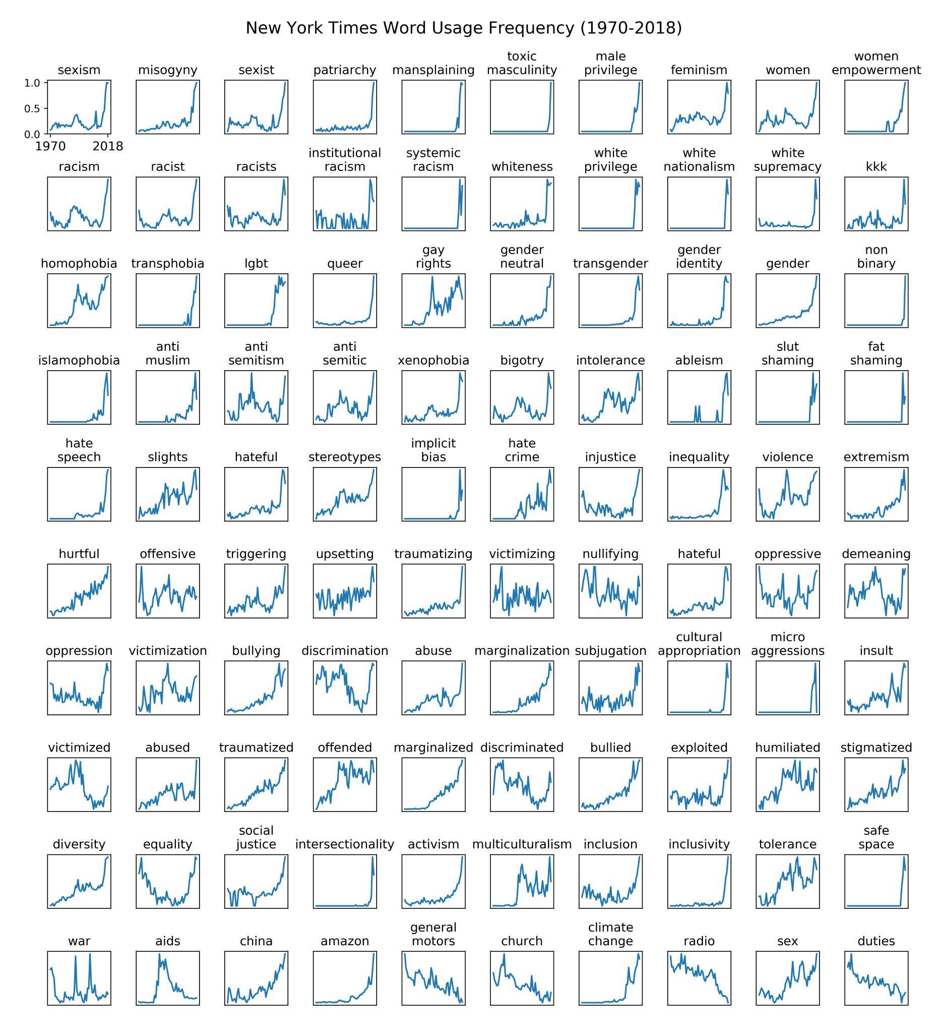
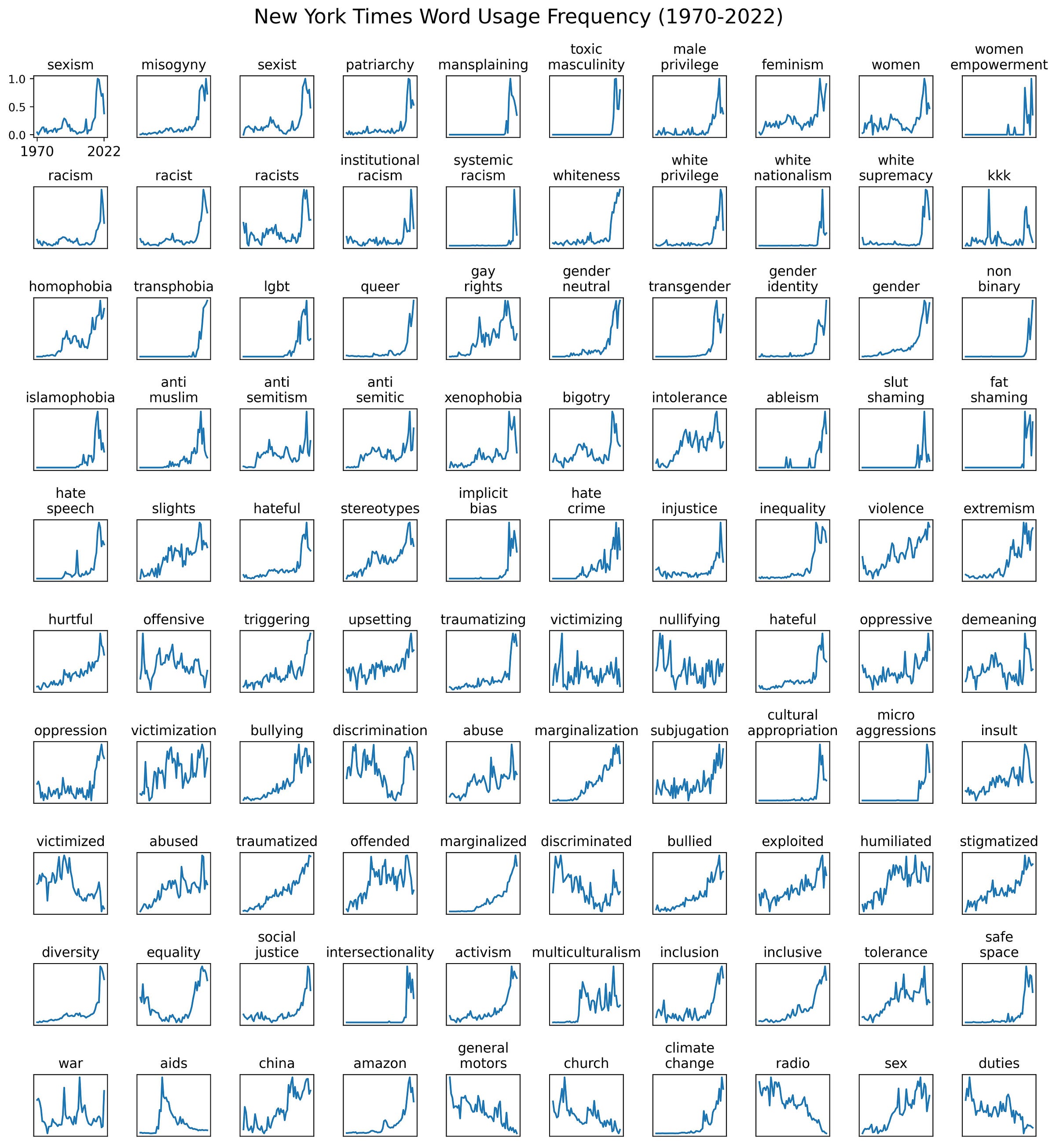
There’s been some talk online about whether we are post peak wokeness. I will have more to say about this when I complete my analysis of several institutions language usage dynamics. For the time being, I provide a timely update of a chart I made in 2019 about prevalence of terms in New York Times news and opinion articles.
This is the chart from 2019:
This is the updated version of the same chart up to the end of 2022:
I hope to have more to say about this in the coming days.
Notes:
My comprehensive analysis of 47 news media outlets usage of prejudice denoting terminology can be found here.
In the updated version of the chart above, I only substituted the term inclusivity for inclusive since the later is more representative of the phenomena under consideration.
There are some minor variation in the raw data between both charts due to improved analytics pipeline in the most recent version.


One issue is that the woke fad constantly generates hot new buzzwords, such as "equity" and "racial reckoning, so taking your 2018 list and updating it to 2022 will always make it look like woke words are in decline when, perhaps, instead the old ones are being replaced with new ones.
Thank you very much for making this freely available.